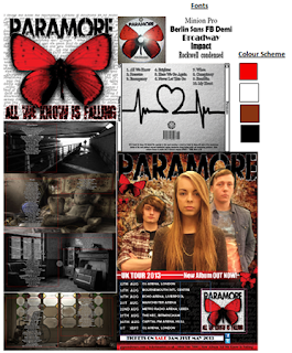
Throughout the construction of the ancillary products and the development it was important to maintain consistency throughout my products, as well as the rest of my group. We had regular meetings to discuss the progress with our ancillary products and as we started the project agreeing on a font very early on in the project because of our pitch and the style guide, this made it easier for us a group because we had already planned the fonts.
My Creation
I constructed a tour dates poster/ album release and a CD digi-pack. The main conventions that I had to consider during the production of my ancillary products was the of my band logo, to use the same fonts as the rest of my group, band card and continuation of the theme of loneliness within the images used in my CD digi-pack as well as continuity with the house style. These conventions could have been improved if I had taken original photographs of the scenery images that I had used in the digi-pack, some of the images I personally took but the random images weren't original. As for the music video it would have been to develop the storyline and to show the beginning, middle and ending clearer to the audience. In post-production it would have been better if I had incorporated the band logo of the butterfly to represent that link between the ancillary products and the main task. Overall, the band shots were well taken but the corporation of the guitarist could have been more prominent as this song is heavily reliant upon the guitar.
Location of Photography/filming
The construction of the photography and filming of the ancillary texts projected the codes and conventions of the style of genre we were aiming for and the use of iconography of the locations reflected the mood of the narrative and the band shots. The choice in locations for the music video was to present the narrative in a messy bed with alcohol to represent a disruption with the character and the juxtaposition of the narrative actress in busy London was to impose the fact that she is amongst a busy world, yet she feels lonely and isolated. The grubby and barred staircase she was sitting on in London was a place of comfort for the narrative actress but the symbolism of the use of bars was to represent how she feels in society as she feels trapped. Whereas the band shots reflected the codes and conventions of the genre and gave a strong sense of mise-en-scene for the rock genre with the use of costume worn by the band, which was very casual clothing and the singer (Eden) had a red top on to fit the colour scheme of the ancillary products.
Choice of colour scheme
The use of the colour scheme was incorporated in the music video as well as the ancillary products. The screen shot above has a swatch of the colours used and these colours are reflected in my music video; through the use of the black screen in the background of the band shots and the use of the singer wearing a red top. The lighting in the narrative shots have a cold and lonely mood and atmosphere within as we shot the narrative actress when it was cold and the sun was hardly visible to make sure the lighting in the daytime would fit the narrative. However, the establishing shots of the actress in bed projected and element of disorientation and darkness with the use of the black and white sheets and the blacked out curtains, which reinforced the depressed atmosphere that we wanted the audience to feel about the narrative. From the screen shots above you can see the cold and bland colours used in the music video reflect the ancillary products. However, this could have been improved if I had used shots of the narrative at night to distinguish the passing of time through the lighting.
Conclusion
Equally, both of the individual ancillary products and the main task have integrated motifs which have worked well together. The main theme within the main task was the combination of the consistent jump cuts and the random images in my ancillary products. This utilization of two motifs across two different media platforms have surprisingly worked well with the genre. To conclude all three of the separate ancillary tasks created work well in unison to create a strong brand image for the band; Paramore. The consistent use of colour scheme, codes and conventions of the genre, fonts and motifs of characters prove to create a combined powerful advanced project. The continuation of these styles have been attractive to the target audience that we were trying to attract.
Analysis of my ancillary tasks


No comments:
Post a Comment