Tuesday 30 April 2013

Evaluation: 2) How effective is the combination of your main product and ancillary texts?


Throughout the construction of the ancillary products and the development it was important to maintain consistency throughout my products, as well as the rest of my group. We had regular meetings to discuss the progress with our ancillary products and as we started the project agreeing on a font very early on in the project because of our pitch and the style guide, this made it easier for us a group because we had already planned the fonts.


My Creation

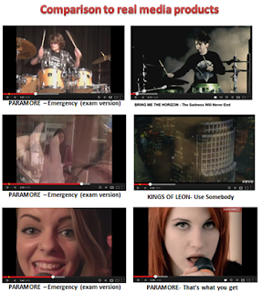
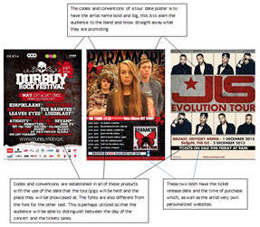
I constructed a tour dates poster/ album release and a CD digi-pack. The main conventions that I had to consider during the production of my ancillary products was the of my band logo, to use the same fonts as the rest of my group, band card and continuation of the theme of loneliness within the images used in my CD digi-pack as well as continuity with the house style. These conventions could have been improved if I had taken original photographs of the scenery images that I had used in the digi-pack, some of the images I personally took but the random images weren't original. As for the music video it would have been to develop the storyline and to show the beginning, middle and ending clearer to the audience. In post-production it would have been better if I had incorporated the band logo of the butterfly to represent that link between the ancillary products and the main task. Overall, the band shots were well taken but the corporation of the guitarist could have been more prominent as this song is heavily reliant upon the guitar.


Location of Photography/filming

The construction of the photography and filming of the ancillary texts projected the codes and conventions of the style of genre we were aiming for and the use of iconography of the locations reflected the mood of the narrative and the band shots. The choice in locations for the music video was to present the narrative in a messy bed with alcohol to represent a disruption with the character and the juxtaposition of the narrative actress in busy London was to impose the fact that she is amongst a busy world, yet she feels lonely and isolated. The grubby and barred staircase she was sitting on in London was a place of comfort for the narrative actress but the symbolism of the use of bars was to represent how she feels in society as she feels trapped. Whereas the band shots reflected the codes and conventions of the genre and gave a strong sense of mise-en-scene for the rock genre with the use of costume worn by the band, which was very casual clothing and the singer (Eden) had a red top on to fit the colour scheme of the ancillary products.  


Choice of colour scheme

The use of the colour scheme was incorporated in the music video as well as the ancillary products. The screen shot above has a swatch of the colours used and these colours are reflected in my music video; through the use of the black screen in the background of the band shots and the use of the singer wearing a red top. The lighting in the narrative shots have a cold and lonely mood and atmosphere within as we shot the narrative actress when it was cold and the sun was hardly visible to make sure the lighting in the daytime would fit the narrative. However, the establishing shots of the actress in bed projected and element of disorientation and darkness with the use of the black and white sheets and the blacked out curtains, which reinforced the depressed atmosphere that we wanted the audience to feel about the narrative. From the screen shots above you can see the cold and bland colours used in the music video reflect the ancillary products. However, this could have been improved if I had used shots of the narrative at night to distinguish the passing of time through the lighting.


Conclusion

Equally, both of the individual ancillary products and the main task have integrated motifs which have worked well together. The main theme within the main task was the combination of the consistent jump cuts and the random images in my ancillary products. This utilization of two motifs across two different media platforms have surprisingly worked well with the genre. To conclude all three of the separate ancillary tasks created work well in unison to create a strong brand image for the band; Paramore. The consistent use of colour scheme, codes and conventions of the genre, fonts and motifs of characters prove to create a combined powerful advanced project. The continuation of these styles have been attractive to the target audience that we were trying to attract.


Analysis of my ancillary tasks


Monday 29 April 2013

Evaluation: 1) In what ways does your media product use, develop or challenge forms and conventions of real media products?

Media products are created and repeated in established ways so that an audience can understand and interpret the codes and conventions of specific media products. It was important when in construction of my media products that I referred to these forms and conventions within existing media products and translate that to my audience as my own creation. This blog post will analyse the way I have developed and challenged forms and conventions of real media products in my advanced production.


I have applied the use of consistent font and colour scheme across all of my ancillary products. During the beginning stages of my production, it was clear that the convention of bands and 'band identity' was something that I needed to make sure I incorporated so that my audience will easily identify the genre through the design of their media text. This was a convention that I didn't want to subvert to, so in order to show a sense of originality throughout my work I had to come up with a new way to capture my audience. This applied by the use of a consistent colour scheme of bright red, yellow, black and images of objects that looked neglected, to reinforce the album name 'All we know is falling'. This would be used to highlight the sub-textual message of the images that all will have something odd about them. This would allows my products to be easily identifiable and interesting to look at as they will include codes and conventions of the Pop Rock genre but they will also challenge the forms.


The ancillary products colour scheme is then further linked to my main task; music video. The music video features cold, grim and lonely colours, of greys and black with the narrative shots but in the band shots there is an element of hope with the use of the red shirt worn by the singer and the bright lights that were used during the filming process. This is shown by the print screens of some of the shots within the music video to the left and the ancillary products to the right.

In my research of tour posters and advertisements of digi-pack products for the pop rock and other genres, I noticed how they include their website and social network logos. These will help to advertise my band as teens are consumed by social networking and word of mouth will be visible and more prevalent if I incorporate the same conventions through my ancillary tour dates poster. As seen in the picture above of my tour dates poster/ album release where I have included involvement advertising with the use of the Twitter and Facebook logo. This further reinforces the band to a wider audience because of the popularity amongst the social networking sites as well as my links to the bands website and a link to buy the tickets. 

I have followed the conventions of using motifs within my media products which is consistent throughout all of my ancillary tasks, as well as the members of my group who all used the same fonts for the band name and the album. The motif of the butterfly was a motif that we all established in our ancillary tasks to been consistent just like the recurrent 'Riot!' in the real Paramore's music video and digi-pack cover for their latest album release. Throughout my CD digi-pack I choose to incorporate the use of images that looked alone or uneasy to reflect the type of album that was being promoted to subvert from the conventions but also to be creative as well as be recognisable to an audience as a Cd digi-pack.

The ancillary products produced, I tried to apply elements of gaze theory with the album specifically because this will be shown mostly on bar doors and walls by people that may have never seen or heard of this band before and I want them to be attracted to the band, especially the lead singer. Through the use of gaze theory a wider audience will be able to associate with the band because of the visual aid. The three band members equally have their own identity that is noticeable when you see them straight away and makes an audience draw to them, equally gaze theory enables both genders to appreciate each member as individuals in their own right. For example, girls want to look like the female main singer and men also identify by finding her attractive, and the same for men aspiring to be like the male members in the band and the females finding the males attractive. I have applied this theory subtly, as through the genre of rock/pop it would subvert conventions by being overtly sexual in their appearance. However, throughout my CD digi-pack gaze theory was not utilized because I didn't think it would be necessary to have an image of the band on the front cover of the magazine like most typical CD digi-packs I wanted to be original and subvert from the conventions.
  
 
Comparisons with real media products


This shows the comparisons between the real media products of a music video beside the music video that I have produced using the conventions of the similar type of genre as mine; Paramore- Emergency. This shows how the codes and conventions of my music video fit with real media products. The project does limit the amount of creativity because you have to fit the genre of your specific song however, my products do show a few elements of creativity that we are able to subvert to in order to appeal to your audience.


Narrative

The narrative in our music video could be taken in a multitude of different ways making it polysomic. This follows reception theory which is based on the idea that no text has one single meaning. The way in which we interpret a text's meaning is dependent on factors such as upbringing, age, frame of reference, location, the mood we are in etc. Reception theorists suggests factors such as gender, social studies, and social context are very important when we construct a meaning for a text. In relation to the narrative we have created, you have a lonely girl who is lost but the main singer has been there and is trying to make her feel as though there is hope for her in the foreseeable future.


 Camera shots
 
 The camera shots we have included in the music video have ranged, but we have mainly followed the conventions seen in existing texts in our genre. We have incorporated close ups of the singers, close ups of instruments, wide shots, two shots, rule of thirds. Below, are examples of the shots we have used.


Thursday 25 April 2013

Evaluation: Creative Arts Evening Feedback

On the 24th April, our school held a creative arts evening which showcased exclusively the work that current A level students had created. This night was the premiere of our music video and we were given the opportunity to stand on stage, deliver a short commentary of our music video and then to showcase our hard work. The evening also gave as a brilliant chance to receive feedback on our final music video.  

This is the response we got after our music video:


The evening was a huge success, with many parents and pupils happily congratulating Trinity A level students on their work. This is the feedback we managed to get:


Thank you for the feedback!

Friday 19 April 2013

Development: Final Tour dates/album release poster

Ancillary Product: Tour dates/ Album release poster
 
I have finished my final ancillary version of my tour dates poster and album release for the magazine advert. I have used the same conventions throughout all of my other ancillary products and so has the rest of my group.
I have in effect subverted the conventions of real media texts but I do believe this has shown and does reflect the genre I'm trying to advertise and I do feel it works well and shows my creativity. I have included conventions such as the logo, style of font, sponsors and social networks to appeal to the audience intended and to look like the media text it is supposed to be reflecting.

Development: Final CD digi-pack


Front cover of CD booklet
 

CD


The inside pages of the booklet

The inside pages of the booklet

The inside pages of the booklet

The inside pages of the booklet

The inside pages of the booklet

The inside pages of the booklet

The inside pages of the booklet

The inside pages of the booklet

The inside pages of the booklet

The inside pages of the booklet

The inside pages of the booklet
 
The last page of the booklet
 
The inside back page of the CD cover


The whole booklet as seen on InDesign

 I initially planned to create a more conventional designed digi-pack 
 shown in my drafts here, however after doing some research into different designs and layouts, I decided to create a more unconventional digi-pack that highlighted the themes of the different song titles instead of sticking the conventional, including every image of the band. The design was captivating to my audience as it's fairly unusual, creative and interesting to look at with the various of images. I have incorporated the motif of the butterfly throughout all of my ancillary's to maintain consistency.

Monday 8 April 2013

Development: Ancillary tasks

These are screenshots of the ancillary tasks that I have approved and they are the early day creations that have lots more to be improved on. I used Adobe Photoshop cs6 to produce my ancillary tasks. 


Here is a short video clip of where I am at the moment with my ancillary tasks; the tour dates poster and my front cover for my digipak


Recent up to date development of ancillary tasks

Tour Dates Poster & Album Release

Front cover of CD/ Digi-Pack

Inside CD cover/ Digi-Pack


Monday 1 April 2013

Planning & Development: Uses and gratifications

The opposite range of audience theories and effects theory is uses and gratifications theory. This is where the active audience assumes or chooses the texts it consumes and where individuals have differing reasons for consuming a media these texts.

Blumler and Katz expanded this theory in 1974 suggesting that their are possible reasons why an audience might consume certain media texts. The types of reasons are as listed:
    • Diversion- escape from everyday problems and routine e.g. watching reality TV.
    • Personal relationships- using the media for emotional and other interaction e.g. substituting soap operas for family life.
    • Personal identity- constructing their own identity from characters in media text, and learning behaviour and values.
    • Surveillance- Information gathering e.g. educational programmes, weather reports, news reports.
In my music video we have included the personal relationships because we wanted to show how the girl in the narrative is feeling really low and isolated which is reflecting through the song because it is being played to reinforce her feeling of wanting to escape. The people that will watch the Paramore- Emergency music video will be mainly people in the cultural code of C-E because of the issues that will be raised and the target audience that the video is aimed at.