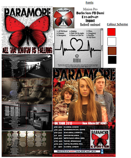
 I have applied the use of consistent font and colour scheme across all of my ancillary products. During the beginning stages of my production, it was clear that the convention of bands and 'band identity' was something that I needed to make sure I incorporated so that my audience will easily identify the genre through the design of their media text. This was a convention that I didn't want to subvert to, so in order to show a sense of originality throughout my work I had to come up with a new way to capture my audience. This applied by the use of a consistent colour scheme of bright red, yellow, black and images of objects that looked neglected, to reinforce the album name 'All we know is falling'. This would be used to highlight the sub-textual message of the images that all will have something odd about them. This would allows my products to be easily identifiable and interesting to look at as they will include codes and conventions of the Pop Rock genre but they will also challenge the forms.
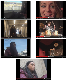
 The ancillary products colour scheme is then further linked to my main task; music video. The music video features cold, grim and lonely colours, of greys and black with the narrative shots but in the band shots there is an element of hope with the use of the red shirt worn by the singer and the bright lights that were used during the filming process. This is shown by the print screens of some of the shots within the music video to the left and the ancillary products to the right.
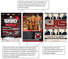
 In my research of tour posters and advertisements of digi-pack products for the pop rock and other genres, I noticed how they include their website and social network logos. These will help to advertise my band as teens are consumed by social networking and word of mouth will be visible and more prevalent if I incorporate the same conventions through my ancillary tour dates poster. As seen in the picture above of my tour dates poster/ album release where I have included involvement advertising with the use of the Twitter and Facebook logo. This further reinforces the band to a wider audience because of the popularity amongst the social networking sites as well as my links to the bands website and a link to buy the tickets.
 I have followed the conventions of using motifs within my media products which is consistent throughout all of my ancillary tasks, as well as the members of my group who all used the same fonts for the band name and the album. The motif of the butterfly was a motif that we all established in our ancillary tasks to been consistent just like the recurrent 'Riot!' in the real Paramore's music video and digi-pack cover for their latest album release. Throughout my CD digi-pack I choose to incorporate the use of images that looked alone or uneasy to reflect the type of album that was being promoted to subvert from the conventions but also to be creative as well as be recognisable to an audience as a Cd digi-pack.
The ancillary products produced, I tried to apply elements of gaze theory with the album specifically because this will be shown mostly on bar doors and walls by people that may have never seen or heard of this band before and I want them to be attracted to the band, especially the lead singer. Through the use of gaze theory a wider audience will be able to associate with the band because of the visual aid. The three band members equally have their own identity that is noticeable when you see them straight away and makes an audience draw to them, equally gaze theory enables both genders to appreciate each member as individuals in their own right. For example, girls want to look like the female main singer and men also identify by finding her attractive, and the same for men aspiring to be like the male members in the band and the females finding the males attractive. I have applied this theory subtly, as through the genre of rock/pop it would subvert conventions by being overtly sexual in their appearance. However, throughout my CD digi-pack gaze theory was not utilized because I didn't think it would be necessary to have an image of the band on the front cover of the magazine like most typical CD digi-packs I wanted to be original and subvert from the conventions.
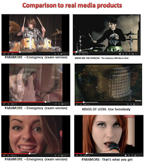
Comparisons with real media products

 This shows the comparisons between the real media products of a music video beside the music video that I have produced using the conventions of the similar type of genre as mine; Paramore- Emergency. This shows how the codes and conventions of my music video fit with real media products. The project does limit the amount of creativity because you have to fit the genre of your specific song however, my products do show a few elements of creativity that we are able to subvert to in order to appeal to your audience.
Narrative
The narrative in our music video could be taken in a multitude of different ways making it polysomic. This follows reception theory which is based on the idea that no text has one single meaning. The way in which we interpret a text's meaning is dependent on factors such as upbringing, age, frame of reference, location, the mood we are in etc. Reception theorists suggests factors such as gender, social studies, and social context are very important when we construct a meaning for a text. In relation to the narrative we have created, you have a lonely girl who is lost but the main singer has been there and is trying to make her feel as though there is hope for her in the foreseeable future.
Camera shots
The camera shots we have included in the music video have ranged, but we have mainly followed the conventions seen in existing texts in our genre. We have incorporated close ups of the singers, close ups of instruments, wide shots, two shots, rule of thirds. Below, are examples of the shots we have used.

No comments:
Post a Comment